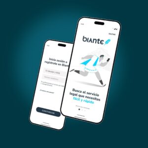
Mobile app design requirements turn a visual concept into a buildable, testable product specification. A small business should define user journeys, information architecture, navigation, platform behavior, responsive layouts, components, content, forms, errors, accessibility, prototypes, usability evidence, handoff files, and approval gates before interface development starts.
This guide owns the UI/UX design-specification intent. It complements LeWebsite resources about product scope, accessibility, performance, testing, and implementation without replacing those separate requirement owners.
Mobile app design requirements should define users, priority journeys, screens, states, navigation, content hierarchy, iOS and Android conventions, adaptive layouts, components, tokens, forms, errors, empty states, permissions, accessibility, prototypes, usability tests, deliverables, owners, approval criteria, and change control. Each requirement needs observable acceptance evidence before engineering begins.
| Design area | Requirement to define | Evidence to approve | Common failure |
|---|---|---|---|
| User journeys | Actors, goals, entry points, steps, alternate paths, interruptions, and recovery | Approved flow map and prototype for every critical journey | Only the ideal path is designed |
| Interface system | Navigation, layout, components, tokens, content rules, and platform variants | Component inventory, state matrix, and annotated screen specifications | Engineering must guess missing states |
| Quality | Accessibility, responsive behavior, usability tasks, and acceptance thresholds | Test notes, issue log, revisions, and signed acceptance record | Approval is based only on visual preference |
| Handoff | Files, assets, copy, interaction notes, ownership, versions, and change control | Versioned source file, export list, requirement links, and decision log | Approved mockups conflict with the implementation backlog |
Start with the mobile app requirements document. Product scope should identify what the app must accomplish; design requirements should explain how supported users understand, navigate, complete, and recover from those tasks. Keeping those owners distinct prevents attractive mockups from silently changing business rules.
“Use a modern interface” is not actionable. Specify which information appears first, which action is primary, what happens after it is selected, how the system communicates progress, and how a user recovers. Colors, type, icons, spacing, and motion should support those decisions rather than substitute for them.
For each screen and component, define default, loading, empty, partial, success, validation, error, offline, permission-denied, disabled, selected, focused, and destructive-confirmation states when relevant. A polished dashboard with no failure or recovery states is not a complete design; it transfers expensive ambiguity to development and quality assurance.
Design scope should cover named user groups, their goals, permissions, context, devices, entry points, critical tasks, alternate paths, interruptions, failure conditions, and recovery. Prioritize journeys by business consequence and frequency, then specify acceptance for first use, returning use, restricted access, incomplete data, poor connectivity, and support escalation.
Map the five to ten journeys that determine whether the product creates value: onboarding, sign-in, search, booking, ordering, payment, field updates, approvals, account management, or support. Avoid designing a screen inventory in isolation. Users experience connected tasks, and transitions expose the assumptions that static screens conceal.
Record whether the journey serves a customer, employee, manager, technician, vendor, or administrator; what that person knows; what permission is available; where the task occurs; and what interruptions are likely. A field workflow used in sunlight with intermittent service needs different priorities from an office approval workflow.
Document what happens when a user declines a permission, lacks data, loses connectivity, enters an expired code, returns after interruption, cancels a payment, or reaches a restricted feature. The recovery path should explain the condition, preserve safe progress, offer a meaningful action, and expose support when self-service cannot resolve it.
Navigation requirements should define content hierarchy, primary destinations, task depth, labels, search, filtering, deep links, back behavior, modal boundaries, saved state, and role-based visibility. Every destination needs a clear entry and exit. Users should know where they are, what changed, and how to continue or reverse an action.
Choose navigation from product structure, not fashion. Bottom navigation can suit a small set of peer destinations; hierarchical navigation can suit drill-down content; task-focused flows may need a guided sequence. The approved design should show how navigation changes for signed-out users, limited roles, deep links, notifications, and interrupted sessions.
Labels should describe the destination or task rather than an internal department or database entity. Test ambiguous labels with representative users. If two destinations sound interchangeable, the information architecture is not settled. Consistent names should appear in navigation, headings, notifications, help content, analytics, and support documentation.
For every overlay and multi-step task, define whether back returns to the prior step, exits the task, dismisses a layer, or follows platform history. Destructive exits need confirmation when unsaved work would be lost. Returning users should resume safely without reopening completed actions or exposing another account’s prior state.
Design requirements should use familiar iOS and Android navigation, controls, typography, safe areas, gestures, permissions, feedback, and accessibility behavior unless a documented product need justifies variation. Shared branding can remain consistent while platform behavior differs. Any custom interaction needs specifications, prototypes, accessibility semantics, and test criteria for both platforms.
Apple publishes the official Human Interface Guidelines for designing for iOS. Google maintains Material Design 3 for Android-oriented interface foundations and components. These systems should inform behavior and expectations; neither removes the need to validate the product’s own users and tasks.
Brand color, voice, imagery, icon style, and product identity can remain recognizable across platforms. Navigation placement, system controls, date pickers, permissions, gestures, feedback, and typography may differ where platform conventions improve familiarity or implementation quality. Record shared tokens and deliberate platform variants instead of forcing pixel-for-pixel sameness.
A custom control should have a business reason, defined states, touch and keyboard behavior, screen-reader semantics, error handling, animation rules, and engineering owner. The approval record should explain why a native or established component was insufficient. Custom work is justified by user value, not merely by making the interface look different.
Responsive requirements should define supported phones, tablets, orientations, safe areas, split-screen conditions, text sizes, content lengths, keyboards, and foldable postures where applicable. Specify how hierarchy, columns, navigation, controls, media, and dense data adapt. Acceptance should test representative constraints rather than one ideal viewport or marketing device.
Android’s official guidance explains how to build adaptive layouts from window size and posture instead of device names alone. The design package should identify breakpoints or layout classes, but engineering and testing must verify runtime behavior with system bars, keyboards, localization, and supported accessibility settings.
When space changes, retain the task’s priority, relationships, and primary action. A two-pane tablet layout may become a list and detail flow on a phone. Controls can move, stack, collapse, or become contextual, but required information and recovery actions should not disappear simply to keep a composition visually balanced.
Use long names, translated labels, large values, empty collections, validation messages, multiline addresses, user-generated images, and maximum supported records. Placeholder copy makes layouts appear more resilient than they are. Define truncation, wrapping, expansion, pagination, zoom, and overflow behavior wherever content length can change the task.
A mobile design system should define tokens, typography, color roles, spacing, elevation, shape, icons, components, variants, states, content rules, accessibility behavior, platform differences, ownership, and versioning. Components need design and engineering acceptance together. A library is useful only when teams can trace screens to implemented, tested patterns.
Connect component quality to the separate mobile app testing requirements. The component specification should identify what can be verified in isolation and what must be tested inside a complete journey. A correct button component does not prove that checkout hierarchy, validation, loading, or recovery works.
Use semantic names such as text-primary, surface-warning, border-focus, and space-section rather than tying every decision to a raw color or number. Semantic tokens allow themes and platform variants to change without rewriting screen logic. Document contrast, dark mode, disabled states, and any brand exceptions with an accountable owner.
Record the source component, design version, code version, status, owner, and consuming screens. When a component changes, teams should know which products and journeys require review. Do not approve a screen against a design-library component that differs from the available implementation without tracking the gap and delivery dependency.
Form requirements should define labels, input purpose, keyboard type, formatting, defaults, validation timing, error placement, preserved values, submission states, confirmation, cancellation, and recovery. Minimize unnecessary fields and explain sensitive requests. Users should understand what is required, why an action failed, and exactly how to complete it successfully.
Design every form with actual business rules, not generic input rectangles. Show optional versus required fields, conditional questions, unavailable values, duplicate records, interrupted submission, server rejection, and successful completion. Coordinate interaction copy with backend validation so the interface never promises a state the system cannot accept or preserve.
Immediate validation works for clear formatting or availability feedback; other errors make more sense after a field or step is complete. Avoid scolding users before they have finished typing. Keep the original value when safe, explain the correction in plain language, connect errors to fields, and focus the first unresolved problem.
Deleting data, canceling service, rejecting work, or overwriting records should communicate the consequence and affected object. Use confirmation when the risk warrants it, not for every minor action. Prefer undo, recovery windows, version history, or soft deletion where product and security requirements allow a safer path.
Accessibility requirements should cover semantic structure, reading and focus order, text scaling, contrast, color independence, target size, alternative input, reduced motion, captions, forms, errors, authentication, and supported assistive technologies. Designers must specify outcomes and states early; accessibility cannot be proven by an automated scan after implementation.
The World Wide Web Consortium publishes WCAG 2.2 as a testable accessibility baseline. Use the dedicated mobile app accessibility requirements to define full acceptance coverage; this design guide focuses on including those decisions in flows, components, content, prototypes, and handoff specifications.
Specify accessible names, roles, states, reading order, initial focus, focus return, announcements, gesture alternatives, reduced-motion behavior, error associations, and text-growth expectations. These requirements should travel with the component or screen. A visual design alone cannot communicate the programmatic information assistive technologies need.
Check hierarchy, content order, contrast, target size, scaling, motion, input, error recovery, and alternative paths before stakeholders approve the visual direction. If accessibility is reviewed later, basic structures may already be treated as fixed. Record unresolved items as delivery risks with owners, dates, and explicit acceptance consequences.
Prototype requirements should name the questions being tested, journeys, fidelity, realistic content, participants, devices, tasks, success criteria, observation method, issue severity, revisions, and approval threshold. Test risky decisions before polishing every screen. A clickable prototype demonstrates intended flow; it does not prove technical feasibility or production performance.
Link high-risk interactions to mobile app performance requirements when loading, synchronization, media, mapping, search, or offline behavior can change the design. Prototypes often simulate instant responses. The specification should show loading, waiting, retry, stale data, background work, and timeouts that real users will encounter.
Give participants realistic goals and observe whether they understand where to begin, notice required information, complete the task, detect errors, and recover. Avoid asking only whether the interface looks good. Record evidence by task and issue, then distinguish comprehension problems from missing functionality, content gaps, and prototype limitations.
Define which findings require redesign, which can move into implementation with tracked acceptance criteria, and who may accept residual risk. Retest changed critical journeys rather than assuming a revision solved the problem. Keep the decision log with the approved prototype version so later changes remain traceable.
Approve a versioned flow map, screen inventory, state matrix, responsive rules, platform variants, component references, tokens, content, assets, interaction notes, accessibility annotations, prototype, usability findings, open issues, requirement links, and acceptance record. Engineering should know what is final, conditional, missing, or experimental before estimation and implementation commitments are locked.
A useful handoff is a shared contract, not a folder of screenshots. It should link every critical journey to product rules, design states, components, content, technical dependencies, test criteria, and decision owners. LeWebsite’s custom app development service connects discovery, UI/UX design, engineering, and verification so scope remains traceable.
Mark each flow, screen, and component as approved, under review, blocked, exploratory, or deprecated. Include the approving person and date. Engineers should not have to infer whether a concept frame is binding. Experimental ideas belong in a separate branch or page so they cannot be mistaken for committed release scope.
When requirements change, record the request, reason, affected journeys, design files, components, engineering work, tests, estimate, decision, and effective version. Small visual changes can alter analytics, accessibility, localization, or business rules. Change control should remain proportional, but silent edits should never become the operating process.
Small businesses usually need clarity about timing, platform variants, prototypes, design systems, and approval. The practical answer is to define connected journeys and measurable states before development, use established platform behavior where it helps users, validate risky decisions early, and keep design, engineering, testing, and business acceptance linked by version.
Write initial design requirements during product discovery, before detailed UI work or development estimates are finalized. Refine them through flow mapping, prototyping, technical review, accessibility review, and usability testing. Approved requirements should exist before engineering commits to a screen or component, while controlled revisions remain possible as evidence changes.
No. Brand identity and product goals can remain consistent, while navigation, controls, permissions, typography, gestures, and system feedback follow platform conventions where appropriate. Any difference should be intentional, documented, and tested. Forcing identical interfaces can increase custom work and reduce familiarity without creating meaningful customer value.
No. A prototype can communicate flow and interaction intent, but developers also need states, business rules, content, responsive behavior, components, tokens, assets, accessibility annotations, technical dependencies, error behavior, acceptance criteria, and version ownership. The handoff must distinguish simulated behavior from requirements the production system must actually support.
A small app still benefits from a compact system of reusable tokens, typography, colors, spacing, icons, and core components. The system can be lightweight, but it should prevent avoidable inconsistency and define states. Its size should match product complexity, platform scope, team structure, and expected maintenance rather than imitate an enterprise library.
Product and business owners approve scope and outcomes; design leads approve interaction and visual coherence; engineering confirms feasibility and platform implications; quality specialists confirm testability; accessibility specialists verify inclusive requirements. Named approvers should resolve conflicts and accept documented residual risks instead of leaving final decisions to whoever implements the screen.
Select five critical user journeys, list every state and business rule, identify supported devices and platforms, then map navigation, components, content, accessibility, and responsive behavior. Prototype the riskiest decisions, test them with representative users, resolve major findings, and approve a versioned handoff before committing engineering estimates or release dates.
Use this sequence:
If your team needs a buildable UI/UX specification rather than a gallery of disconnected screens, contact LeWebsite for a focused mobile app discovery and design-requirements session.
If this article raised questions about your own site, book 20 minutes with Francisco or send us a WhatsApp. No commitment, no long forms.
Or by phone: +1 (713) 396-5007 · +503 7931-1403
Subscribe to our
newsletter.
Get valuable strategy, culture, and brand insights straight to your inbox.
By signing up to receive emails from Motto, you agree to our Privacy Policy. We treat your info responsibly. Unsubscribe anytime.